バイブデザイン〜GoogleStitchを使ってみる
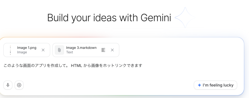
GoogleStitchにセミナー申し込み用のLPを作ってもらおうと思います。入力しました。
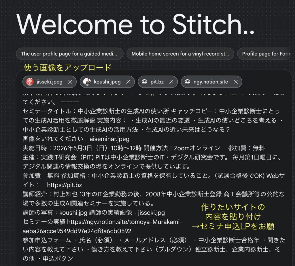
デザインルールを編集
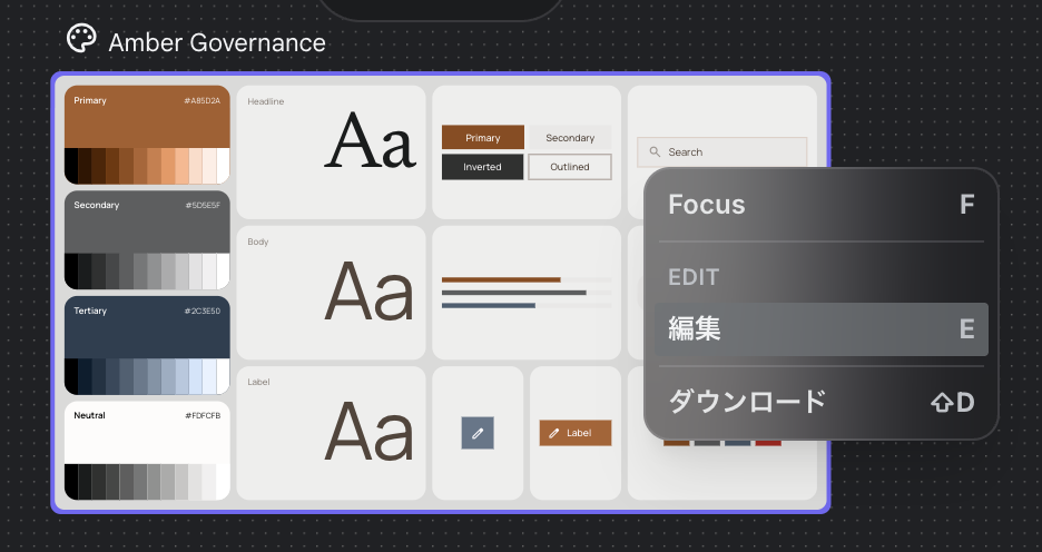
色の微調整などカラーパレットでできる他, mdファイルで細かい設定が指示されいます。
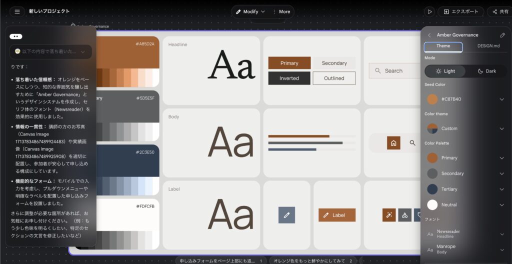
生成された desgin.md
色合いとかサイズとかも含めて細く指示する内容が生成されていました。
# Design System Document
## 1. Overview & Creative North Star: "The Distilled Authority"
This design system is engineered to project a sense of seasoned expertise and quiet confidence for Management Consultants (Chusho Kigyo Shindanshi). Moving away from the generic, loud marketing templates common in the seminar industry, we embrace **"The Distilled Authority."**
The "Creative North Star" focuses on an editorial, high-end aesthetic that values white space as a structural element rather than a void. The design breaks standard patterns through:
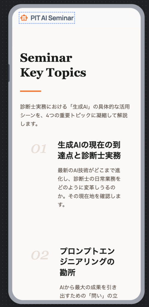
- **Intentional Asymmetry:** Off-center text alignments paired with oversized imagery (like {{DATA:IMAGE:IMAGE_1}}) to create a dynamic, modern rhythm.
- **Layered Composition:** Treating the landing page as a series of overlapping planes. Background elements, text, and photos should bleed across section boundaries to create a sense of continuity.
- **Typographic Gravity:** Using high-contrast scales between `display-lg` and `body-md` to establish an immediate, unquestionable hierarchy.
## 2. Colors
The palette is anchored by a sophisticated, "burnt" orange and a range of warm, stony neutrals. This avoids the "cheap" feel of high-saturation oranges, replacing it with a leather-and-parchment professionality.
### Palette Strategy
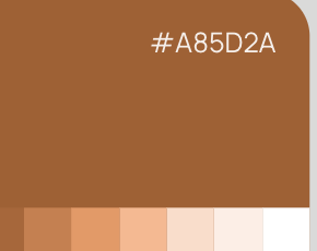
- **Primary (`#8f4917`):** Use this muted orange sparingly for strategic emphasis. It represents action and insight.
- **Surface & Background (`#faf9f8`):** The primary canvas is a warm "Paper" tone, not a sterile digital white.
- **Tertiary (`#4c5e71`):** A slate blue used to ground the orange, providing the necessary "business" weight.
### Layout Rules
- **The "No-Line" Rule:** 1px solid borders are strictly prohibited for sectioning. Contrast must be achieved through background shifts. For example, a `surface-container-low` section should transition directly into a `surface` section without a divider.
- **Surface Hierarchy:** Create depth by nesting. A card using `surface-container-lowest` should sit on a `surface-container` background to create a subtle "lift" that feels physical, not digital.
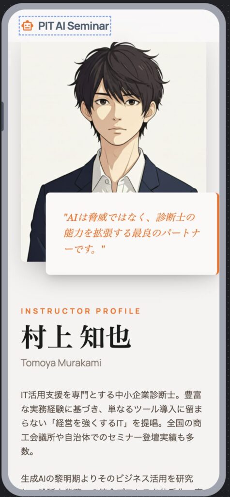
- **The "Glass & Gradient" Rule:** For floating navigation or achievement overlays (like {{DATA:IMAGE:IMAGE_2}}), use Glassmorphism. Apply `surface` at 80% opacity with a 20px backdrop-blur.
- **Signature Textures:** Apply a linear gradient from `primary` to `primary_container` on main CTAs to add a "satin" finish that flat colors cannot replicate.
## 3. Typography
The typographic system pairs the modern, humanist character of **Manrope** with the authoritative, editorial grace of **Newsreader**.
- **Display & Headlines (Newsreader):** Used for titles and key pull-quotes. This serif font establishes the "Consultant" persona—professional, educated, and trustworthy.
- **Body & Titles (Manrope):** Used for all functional text and UI elements. Its clean geometry ensures maximum readability for complex seminar details.
- **The Hierarchy:**
- `display-lg` (3.5rem) is reserved for the Hero impact statement.
- `headline-md` (1.75rem) serves as the entry point for new content sections.
- `body-lg` (1rem) is the standard for long-form seminar descriptions, providing an airy, readable pace.
## 4. Elevation & Depth
We eschew traditional shadows in favor of **Tonal Layering**. The goal is a UI that feels like it was "assembled" from premium materials.
- **The Layering Principle:** Stack `surface-container` tiers (Lowest to Highest) to define hierarchy. An "Important Notice" box should be `surface-container-highest` to naturally draw the eye through value contrast.
- **Ambient Shadows:** If a floating element (like a registration modal) is required, use a shadow with a 40px blur, 0px offset, and 6% opacity of `on_surface`. This creates a soft, natural glow rather than a harsh drop shadow.
- **The "Ghost Border" Fallback:** If a container needs more definition, use a `outline_variant` border at 15% opacity. It should be felt, not seen.
- **Softening Imagery:** Photos like {{DATA:IMAGE:IMAGE_1}} should be placed in containers with `xl` (0.75rem) roundedness to soften the "corporate" edge and make the instructor feel approachable.
## 5. Components
### Buttons
- **Primary:** `primary` background with `on_primary` text. Use `xl` roundedness. Incorporate a subtle 2px bottom "depth" shadow of `primary_container` for a tactile feel.
- **Secondary:** `surface_container_highest` background. No border.
### Cards & Lists
- **Achievement Cards:** When displaying images like {{DATA:IMAGE:IMAGE_2}}, use a `surface-container-low` background. **Forbid dividers.** Use `16` (5.5rem) vertical spacing to separate list items.
- **Instructor Profile:** Use an asymmetric layout. Place the photo ({{DATA:IMAGE:IMAGE_1}}) overlapping the edge of a `surface_container` box containing the bio text.
### Inputs & Fields
- **Search/Form Fields:** Use `surface_container_lowest`. Use a "Ghost Border" that transitions to a 2px `primary` bottom-border only on focus.
### Additional: The "Trust Bar"
A specialized horizontal scroll component for logos or partner SME organizations. Use `surface_variant` at 50% opacity to create a subtle "watermark" effect for the logos.
## 6. Do's and Don'ts
### Do:
- **Do** use the `24` (8.5rem) spacing token between major sections to allow the professional content to "breathe."
- **Do** use `headline-sm` for "Trustworthy" pull-quotes in the middle of body text.
- **Do** crop {{DATA:IMAGE:IMAGE_1}} with a focus on the instructor's expression, leaving ample "copy space" to the left or right.
### Don't:
- **Don't** use pure black `#000000`. Always use `on_surface` (`#1a1c1c`) for text to maintain the muted, sophisticated atmosphere.
- **Don't** use "Alert" colors for non-critical information. Maintain the calm orange/neutral palette.
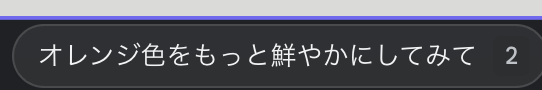
- **Don't** use standard grid-aligned icons. Opt for custom, thin-stroke (1px) icons that match the `outline` color.提案にもっと色を鮮やかに、というのがあったのでやってみましょう。
もう少し色鮮やかなオレンジでのプロトを作ってくれましたね
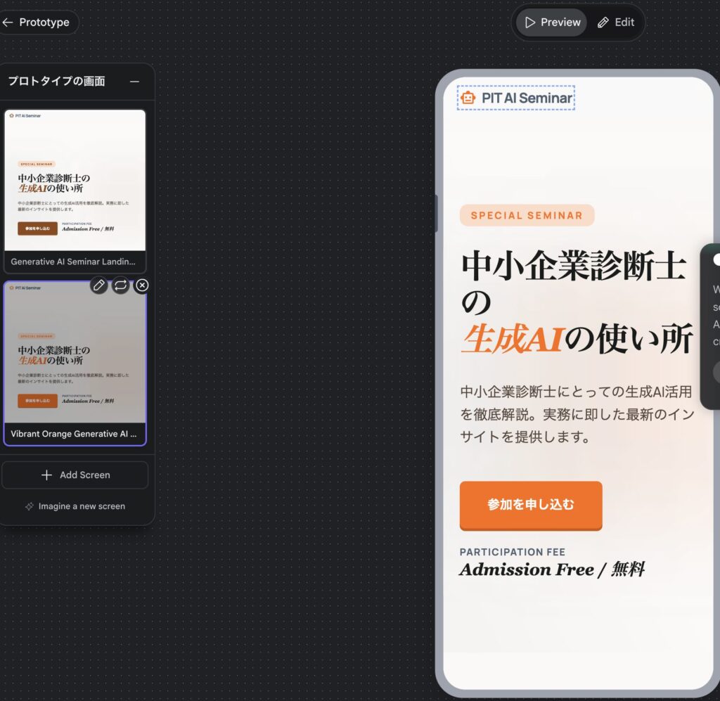
プレビュー
微妙に英語が混じっていたり
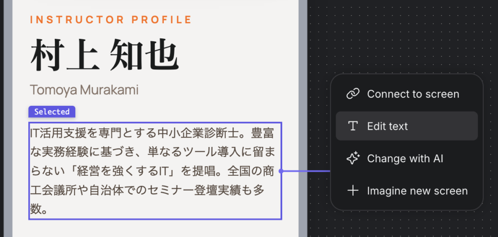
私のアップした写真をつかってくれなくて、勝手にイラスト入れてたり、なかなか一発で言うことをきいてくれるわけではなかったです。
作成した内容をそのままEDITできたりするのはいいですね。
コーディングへ
指示を微調整して、最終的にはエクスポートしてコーディングしていくことになりそうですね。 Figmaに飛ばすなら最初からFigmaでやりはりそう。そうすると、AI Studioにおくって、Google内で調整していくことになるのか。
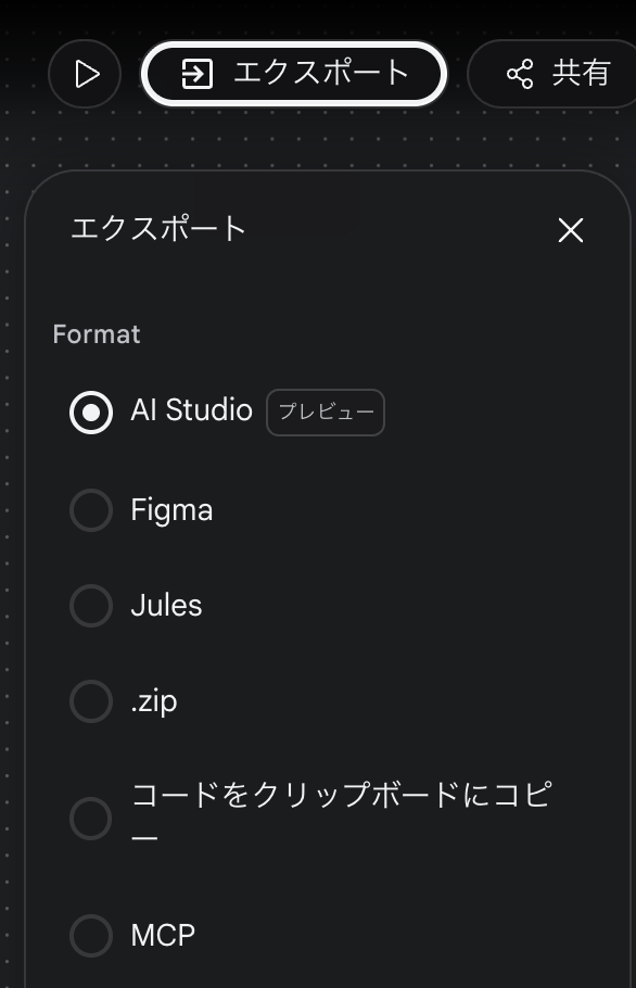
AI Studioへ行って構築していくんでしょうかね。
感想
現時点ではClaudeとかでやっちゃったほうがよさそうですが、バイブデザインということで、いろいろデザインの調整とかがmdで残っていくのが良いのかもですね。
そんなところで